Bringing Apollo into Krowe’s workspace
Role
Product Design Intern
Team
Mandy Liu
Anushka Rane
Riddhima Patllollu
Ryan Nikopour
Tools
Figma, Figma MCP, Claude Code, Cursor
Timeline
Jun 2026 to Sep 2026
Summary
I designed hotkey and edge-hover access to Apollo, taking it from an interactive prototype through CEO approval to shipping across eight dashboards.
Scope
AI Interaction Design
User Acceptance Testing
Onboarding
Design Systems
Design to Code Handoff
What shipped and what the pilot measured
8
dashboards shipped with hotkey/hover invocations
23%
shorter time to next value in a small activation pilot
Context
An assistant on a separate page
The CEO supplied AI-generated drafts. I refined their hierarchy and interaction patterns in Figma so people could ask Apollo for help while keeping the current project in view.
Krowe is a client workspace for agencies and freelancers. Apollo reads project documents and acts on tasks, but reaching it meant opening the Agents page or knowing a shortcut.

Activation pilot
23%
improvement in time to next value
Test focus
Onboarding and agent activation
Read this as directional
Combined changes do not isolate the effect of each interaction.
Research
Test the path to first value
I established Krowe’s first user acceptance testing pipeline to evaluate onboarding and agent activation. The pilot gave the team a repeatable way to review how people reached value in Apollo.
The small pilot recorded a 23% improvement in time to next value. This is directional evidence from combined activation changes, so it does not establish which design change caused the improvement.
Onboarding
Refine the onboarding sequence
Center the onboarding question
The CEO’s draft placed a workspace preview beside each question, which split attention between the preview and the choice. I centered the choices while keeping the questions, then connected the revision in a clickable prototype.


Save identity for later
I moved identity later so people could start with short choices. The identity and teammate forms share field widths and alignment as the sequence moves toward a shared workspace.
Access
Bring Apollo into the workspace
Share navigation across the hub
I brought the Agents Hub into the navigation shared by the other dashboards. Its catalog and recent runs stay together, while dashboard entry points remove the need to return to the hub for every request.


Let search become a prompt
The search bar opens the command palette so a page or task search can become a request to Apollo. People get a visible entry point, with a hotkey available for repeat use.
Keep the project beside the conversation
The 420px sidebar leaves the current project visible beside Apollo. In the 1440px design, 1020px remains for the workspace, so someone can refer to a task or document while asking about it.


Offer actions before a blank prompt
Give each action a destination
The /add-task action has a visible destination on the build board. Its columns show status and its cards hold task details within the same workspace navigation.


Keep runs available after dismissal
The queue keeps the run accessible after someone closes the sidebar. A completion banner offers a way back when Apollo finishes.
Identity
Give Apollo a voice during a run
Name the stage of a run
When Caw became Apollo, I redesigned the mark around a rocket and kept Krowe’s colors. I wrote 38 status phrases across nine phases to describe work such as reading context or composing an answer.


Make completion easier to notice
The first completion banner blended into the page, so I gave it an orange fill and border. That treatment was intended to make a finished run noticeable without suggesting an error.
Workspace
Keep a familiar frame across documents
Set release scope before drafting
PRD setup asks which modules belong in the first release before opening the editor. A suggested option provides a starting point, with other modules and a write-in choice still available.


Keep the outline within reach
The outline stays beside the requirements as the PRD grows. I reused Krowe’s navigation so moving between editors would not mean learning a new page structure.
Keep cost groups readable
Grouped costs lead to a project total in the quote editor. Its outline and top navigation follow the same pattern as the PRD and contract editors.

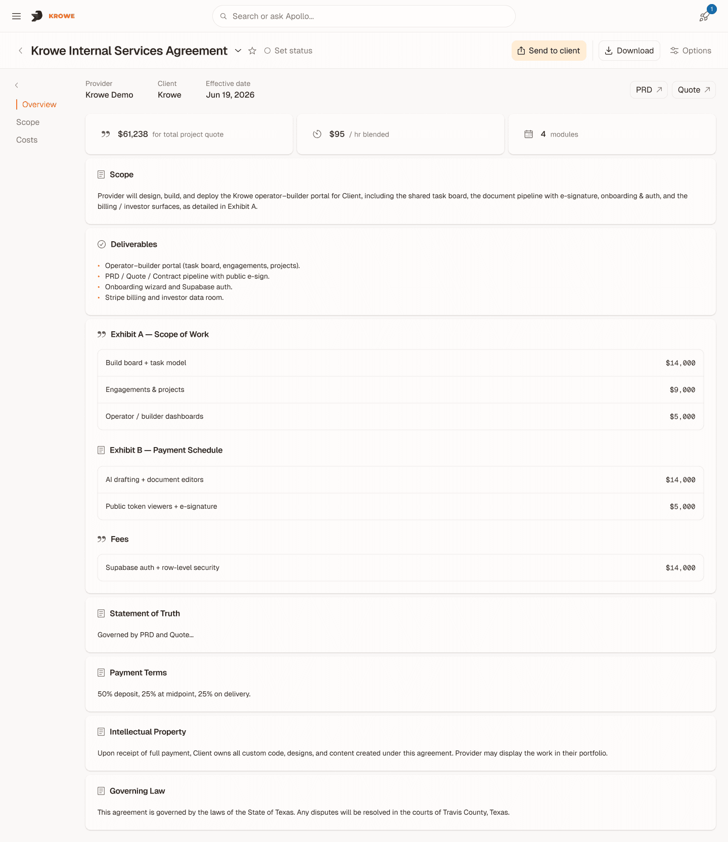
Carry the same frame into contracts
A familiar document frame holds scope and service terms in the contract editor. I kept its typography and corner radii consistent with the other editors and Apollo.
System
Reuse the interaction patterns
Reuse the choice states
Single-choice and multiple-choice cards share the same base. A border marks selection; multiple-choice cards add a checkmark.
AI agency
LLMs & agents: copilots, RAG, automations, pipelines.
Single · Default
SUGGESTED
AI agency
LLMs & agents: copilots, RAG, automations, pipelines.
Single · Suggested
AI agency
LLMs & agents: copilots, RAG, automations, pipelines.
Single · Hover
AI agency
LLMs & agents: copilots, RAG, automations, pipelines.
Single · Selected
AI agency
LLMs & agents: copilots, RAG, automations, pipelines.
Multiple · Default
SUGGESTED
AI agency
LLMs & agents: copilots, RAG, automations, pipelines.
Multiple · Suggested
AI agency
LLMs & agents: copilots, RAG, automations, pipelines.
Multiple · Hover
✓
AI agency
LLMs & agents: copilots, RAG, automations, pipelines.
Multiple · Selected

Shared reference by another Krowe designer.
Name colors by their role
Screens and code documentation used conflicting values, so I proposed semantic roles such as color/surface/1. Components could refer to a color’s purpose while the palette defined its value.
I used Claude Code and Figma MCP to prepare the 130+ token Color System Proposal for engineering. It was not fully adopted, leaving agreement on a shared source of truth unfinished.
Reflection
What I would change next
01
Agree on tokens earlier
The color proposal came after most screens were finished, which sent me back through earlier choices. Next time I would validate semantic roles on one dashboard before extending them across the product.
02
Review unresolved choices sooner
Weekly CEO check-ins left gaps between decisions. Shorter prototype reviews with the other designers would bring disagreements forward before they spread into more screens.
03
Test the entry points separately
Compare visible search access with the hotkey in separate tasks. That would help isolate the effect of each entry point from the combined pilot result.
04
Test recovery after dismissal
Ask people to find a completed run after closing Apollo. The task would check whether the queue and completion banner make returning to work clear.